Hi friends! WHAT GOES WITH WHAT will be out in just a few weeks. I recently got to hold my very first copy (and share that moment with my mom which was just so sweet) so it’s all feeling VERY REAL. It’s been so fun sharing some behind-the-scenes stories with you. So today I wanted to share about how the book cover came to be. Let’s start at the end, shall we? Here is the final cover:
Book covers are a notoriously hard nut to crack. We’ve all been taught not to judge the contents of a book (or anything) by what’s on the outside. And yet…we often do just that. Check out this piece from
for a deep dive on cookbook cover conventions and how many books have been able to disrupt those norms:For the cover of WHAT GOES WITH WHAT, I don’t think we necessarily broke any molds. But I do think we managed to convey what the inside of the book contains. The cover echoes the charts that are the heart of the book and features a mix of photos that hopefully give you a sense of what’s inside: food, of course, but also personal details that give you context for all the food, like the inside of my kitchen cabinets, my dogs, and my time on Long Season Farm. The words and lines are in my handwriting and the colors behind the handwriting are the palate of the book itself.
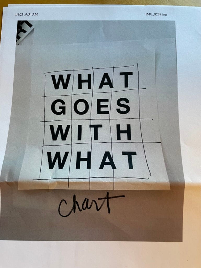
So how did we get there? And who is this “we”? The road to the final cover was paved with ideas and drafts, most of them thanks to my mother. Here is a simple sketch she sent me in April 2023 with the title set in a chart-like grid:
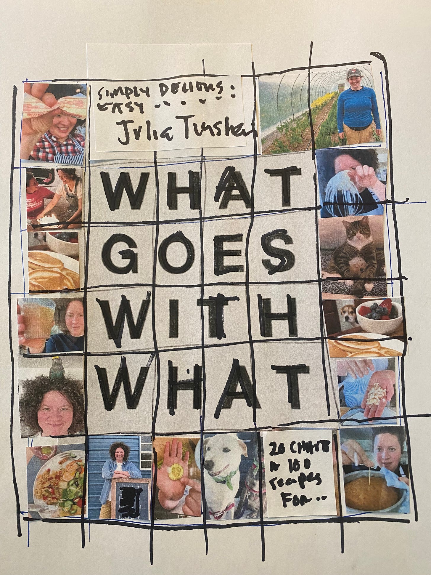
I loved the concept of having the chart somehow represented on the cover and we talked about adding photos for more LIFE. So then my mom mocked this up:
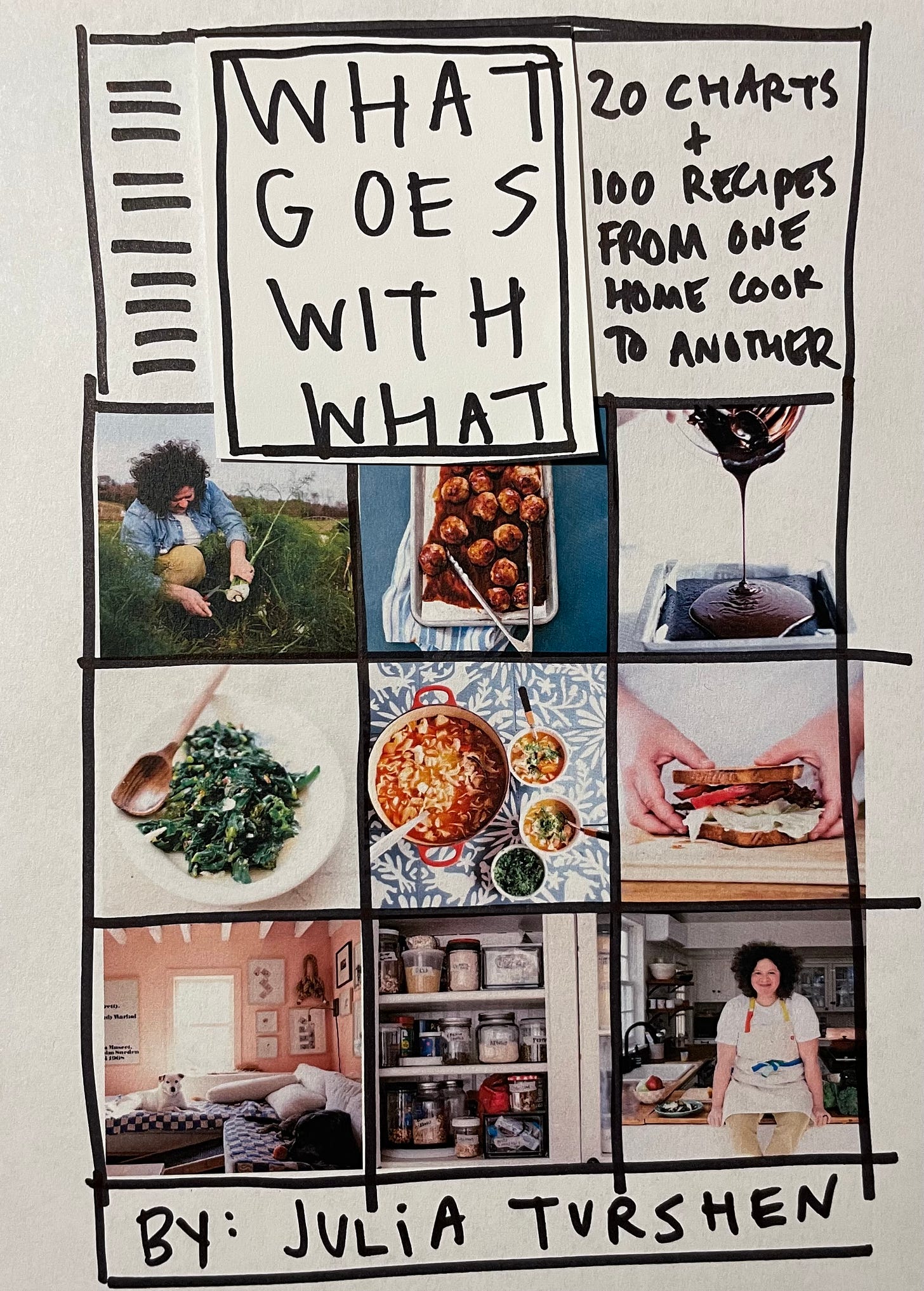
The above ^ is definitely when it all started feeling real. But we agreed it might be good to simplify a bit. So I took my mom’s sketch and mocked up my own. Note the subtitle in the below is different from the final subtitle but I still really love it (“20 Charts + 100 Recipes From One Home Cook to Another”).
And here’s another version with color behind the title (and again, another subtitle!) and a few different photo options:
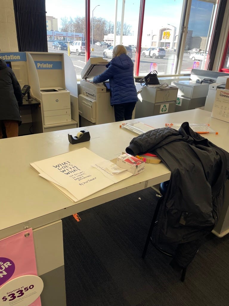
At this point we were nearly there. We sent all the sketches over to Flatiron Books (my publisher) and Keith Hayes, their cover designer, worked some magic to put it all together. First up, I had to nail the handwriting and scan it. Here’s a photo I snapped from that moment at Staples (shout out to Roxann, the Print & Marketing Supervisor at the Kingston, NY store who helped me with the scans!).
And…drum roll please…here is the final result in my hands, in my kitchen. I can’t wait for it to be in yours.
You can pre-order WGWW here! And a quick note to say that yes, I know I’ve been talking about it this book A LOT. You have all been so supportive and your enthusiasm means so much. But I promise not to be a broken record about it forever! I have a big new plan for this newsletter and there will be more recipes etc. coming your way very soon! <3 <3
Before I go! Have a kid in your life who wants to cook with me?? I’m offering one of my Kids Cooking Hour! classes this coming Sunday.
I have loved to cook since I was a little kid. Feeling empowered in the kitchen has made a big difference in my life. I hope to share this feeling with young cooks in this special Kids Cooking Hour! For this class, we’ll be making:
Tuna Melt Sandwiches
Peanut Butter Cookies
Depending on age, experience + kitchen confidence, an adult might be needed to help (grocery shopping, turning on the oven, etc.). We will walk through every single step slowly and answer questions. This is going to be FUN!!!!!
SIGN UP HERE!!!
alright friends, thanks so much for being here!!!!!!!!!! have a great end of your week xoxooxoxoxoxo


Congratulations! I love all these behind the scenes newsletters and can't wait to hold it MY hands in MY kitchen.
Not sure if this was intentional, but the cover is definitely giving me Eras Tour vibes and I am HERE FOR IT.